
American Apparel Font – Discover the Name
American Apparel is a clothing company and retailer. It is known for its cotton basics. The company was founded in Los Angeles.
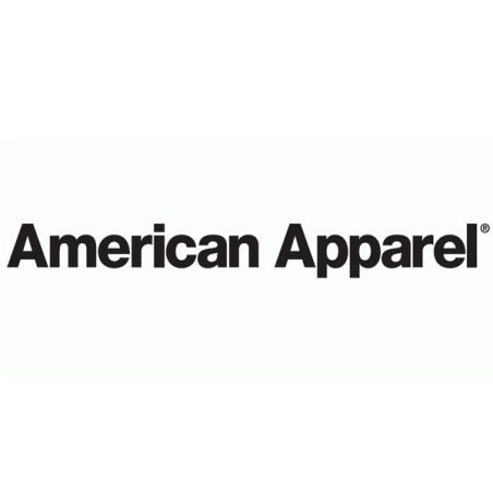
The title uses a very thick weight. It features bold letters with clean, straight ends. Each character has a uniform thickness. The design utilizes both uppercase and lowercase lettering. The letters are close together.
These specific visual traits reflect the identity of the brand. The heavy weight sets a confident tone. The uniform thickness suggests utility. The overall style is modern and straightforward. The precise gaps create balance. This approach matches the brand focus on simple garments. The lack of decoration appears efficient.
What Fonts Are Used?
Helvetica Black serves as a comparable alternative option to the typography used in the American Apparel lettering. Designed and released by foundry Linotype, this typeface provides letterforms curated to closely reflect the style of the clothing brand’s identity.